


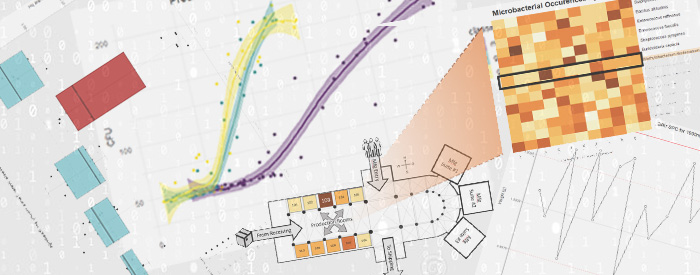
Four Data Visualization Tools Applied to Life Sciences
Data visualization is a crucial element of any life science work, and it is especially important in communicating the work coming out of labs. The ability to explore and mine complex datasets is essential for communicating meaningful conclusions. Life sciences researchers rely on a variety of data visualization tools to help them analyze and interpret their data, including graphs, charts, and other more complex digital representations like artificial neural networks (ANN) and machine learning (ML). In this blog post, we’ll discuss four common data visualization techniques.
Scatter Plots
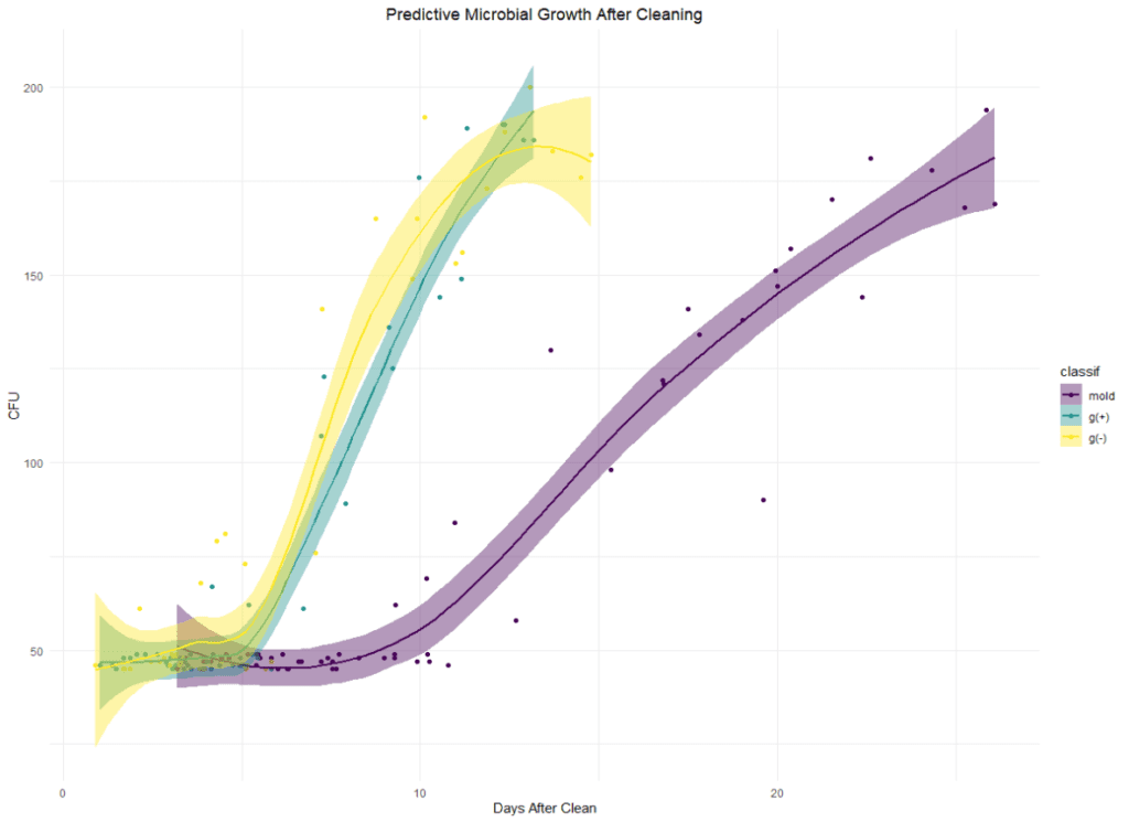
One of the most commonly used data visualization tools in life sciences labs is the scatterplot. Scatter plots are simple graphical representations that display the relationship between two variables. They are particularly useful for visualizing correlations between variables, such as the relationship between microbial proliferation levels days after cleaning a manufacturing area. In a scatter plot, each data point represents a single measurement or observation, and the x and y axes represent the two variables being compared. Moreover, if a researcher finds patterns among the data points—such as clustering—they can perform further analysis to parse the differences. This technique is called classification and is significant in more predictive computational methods like ML.
Line Graphs
Although not as flashy as their younger cousins, the scatter plots, line graphs are the workhorses of visualizations for production and research data. They’ve been around for a long time, and their simplicity and prevalence lend themselves to quick viewer understanding. These graphs help display trends in data over time. Quality control labs often use them to track changes, like those in HPLC column life spans, in response to different experimental conditions or products tested.
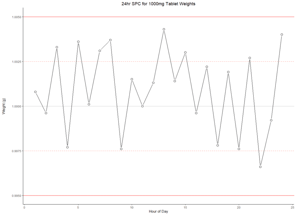
These graphs are also valuable for monitoring conditions in real time. A whole subsection of statistical study called statistical process control, or SPC, is used in manufacturing environments to ensure control of a process is maintained. Our example line graph demonstrates SPC with the precise weights of a pharmaceutical tablet.

Heatmaps
Heatmaps have gained popularity in life science as more modern, computation-heavy hardware/software has come online. Heatmaps are graphical representations of data that use color coding to represent the intensity of a particular measurement or observation.
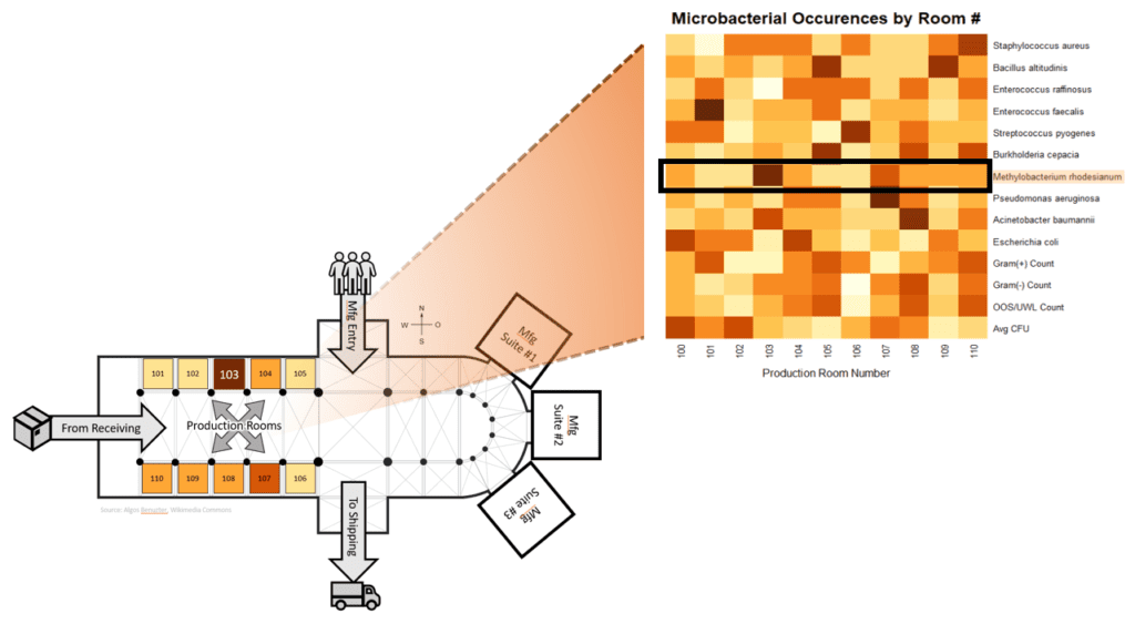
Heatmaps are often used to display the results of high-throughput experiments, such as those used to screen large numbers of compounds for their effects on a particular biological process—think of The War on Cancer or ensuring a new product’s safety to the public prior to launch. Analysts can use heatmaps to uncover hidden data patterns and areas of interest for further investigation. The diagram shows how they could be used as a practical way to view microbial contamination in a production environment. At a glance, we can tell which room at our site has the highest occurrence of, say, Methylobacterium (Room 103).
Box Plots
Box plots are commonly used to get an initial feeling for a dataset and are very useful for quickly finding any extreme parameters of a dataset. Box plots are graphical representations of the distribution of a single variable. They show the median value, the interquartile range (the middle 50% of the data), and the range of the data (from the maximum value to the minimum value).

Box plots are useful for identifying outliers and comparing a variable’s distribution across different experimental groups or conditions. Imagine SPC data from a water treatment facility. Like histograms (special bar charts showing data distribution frequency), box plots show how the data is distributed with the added benefit of clearly displaying outliers. In our example box plot, we’ve plotted pH for five wastewater tanks. We can see immediately that Tank 2 went out of spec on the low end, likely because of some outlier readings in the nighttime hours (seen with help of the overlaid light/dark data points). This provides a quick place to start when investigating the root cause.
Data Visualization Of The Future
In addition to these standard data visualization tools, many life sciences researchers use more specialized means to see their data. For example, data scientists often use ANNs to study the structure and function of relationships between attributes and how they interact to create a predictive model. These tools allow them to comprehend the complex interactions between different parts of the analysis and understand (at least partly) how their model arrives at its prediction.
Similarly, scientists can use techniques such as decision trees (or, when combined, random forests) to visualize the flow of a process and arrive at a prediction with varying degrees of complexity. Random forests generate enormous quantities of data that analysts can only comprehend using these new, updated visualizations. Line graphs won’t cut it for such vast data collections, hence the forest metaphor.

Today, data visualization is an essential discipline for life sciences laboratories. By providing viewers with a graphic representation of complex datasets, these tools allow researchers to find patterns and trends that may not be apparent from raw data alone. They also allow communication of findings among peers in a straightforward and concise manner, making it easier for colleagues to replicate and build upon one another’s work. As datasets continue to grow in size and complexity, the importance of data visualization in the life sciences will only continue to increase.
If you have complex data visualization and analysis needs, let us know how we can help.

